
Widget setup — step 1
Configure the operator name, avatar and colours with a widget preview
Architecture and functionality of the first widget setup step
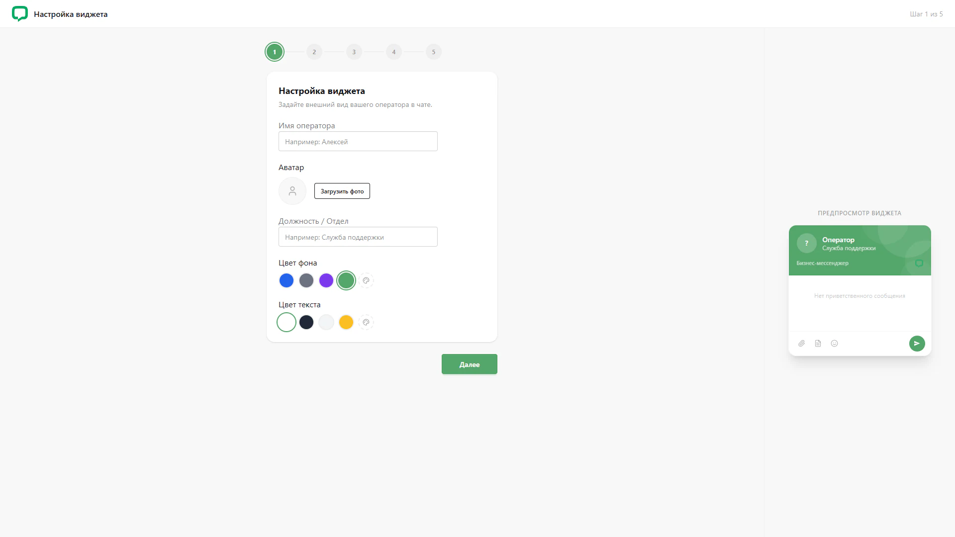
This screen opens the LiveChat setup wizard and focuses on the operator’s appearance in chat. The header reads Widget setup and indicates Step 1 of 5. The main form sits in a white card, with a separate preview area on the right.
1. Setup sequence
A five-step numbered progress indicator appears above the card. Green highlights the first step, while the remaining steps use a neutral colour. A Next button below the form indicates the route to the next stage of the wizard.
2. Operator identity
The Operator name and Position / Department fields define how the employee or service is presented in chat. Example values clarify the expected input. An avatar section between the fields contains a circular placeholder and an Upload photo button.
3. Colour settings
Separate rows of colour swatches are provided for the background and text. Outlines mark the selected options: green for the background and white for the text in this screenshot. Palette buttons beside the preset colours offer an additional colour choice.
4. Widget preview
The right-hand preview shows a chat with a green header, an avatar placeholder, the name Operator and a Support service subtitle. The message area indicates that no welcome message is set. The bottom bar contains attachment, document and emoji icons alongside a send button. The preview lets users assess the widget’s composition beside its settings.
Separating the form from the chat sample helps relate the options to the interface’s appearance. The progress indicator and continuation button place this first stage within a clear setup sequence.