
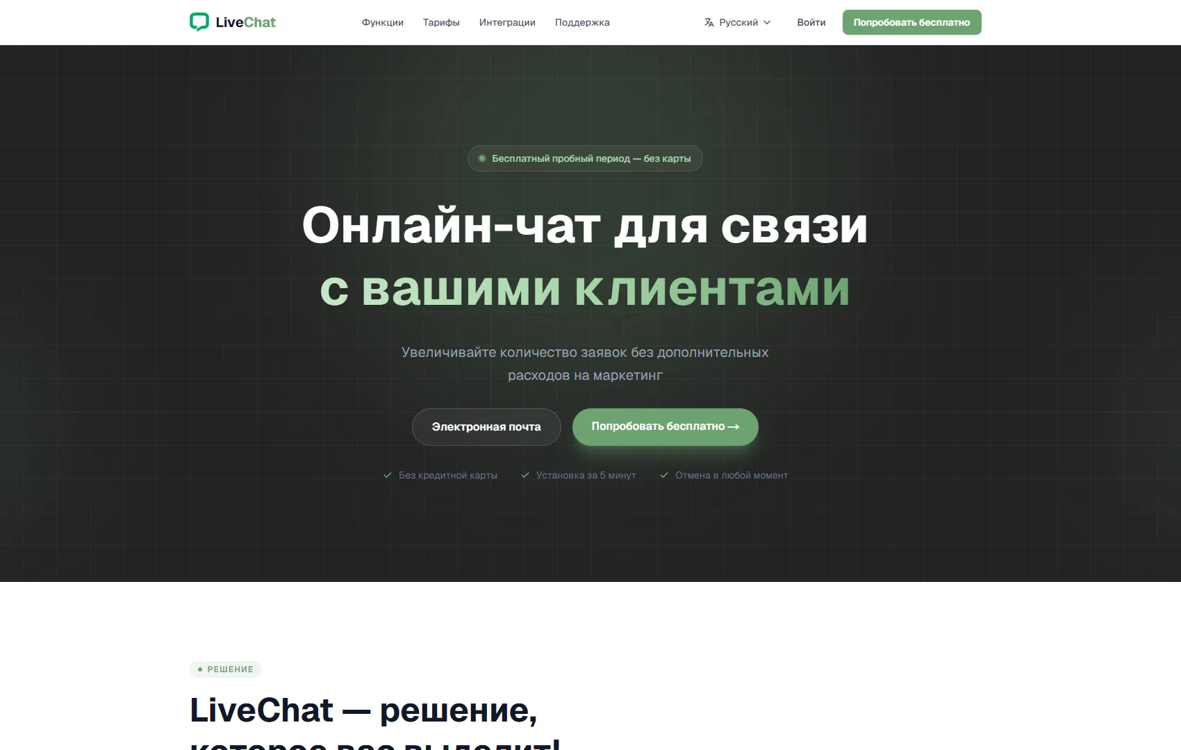
Main screen
Online chat introduction and free trial entry point
Architecture and functionality of the LiveChat main screen
The landing page introduces online chat for communication between businesses and customers. The large headline explains the service’s purpose, while the subtitle presents the offer of more enquiries without additional marketing spending. The layout combines navigation, a product introduction and a free-start form.
1. Header and product navigation
The light header contains the LiveChat logo and links to Features, Pricing, Integrations and Support. A language selector, Sign in action and green Try for free button sit on the right. This arrangement provides access to product information, the account and the trial journey.
2. Visual presentation of the main offer
A dark background with a fine grid and soft green glow highlights the central content. The two-line headline uses white to introduce the product and green to emphasise customer communication. A “Free trial — no card required” badge above it immediately communicates an entry condition.
3. Free-start form
An Email field and a Try for free button with an arrow appear below the description. Visitors can enter their address and proceed towards getting started. The primary action repeats the header button and remains prominent beside the service’s offer.
4. Entry conditions and further exploration
Three checked captions below the form state “No credit card”, “Setup in 5 minutes” and “Cancel anytime”. They clarify the advertised trial conditions. The light Solution section begins at the bottom, continuing the product presentation.
This structure helps visitors understand LiveChat, review the terms and choose their next step: explore the site, sign in or start a free trial.